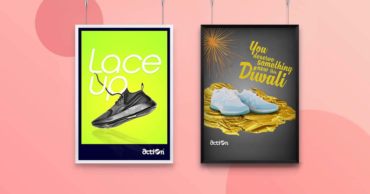
Action Shoes approached Cravants for modernizing the brand in accordance with the changing trends. That included refurnishing the brand image followed by a relaunch event and media coverage of the new identity.
The previous logo had an outdated look and few other font discrepancies. It was composed of two colours – red and black. Knowing that it is easier for the audience to remember a single brand colour, we decided to use the red as the universal colour for the logo and other collaterals.
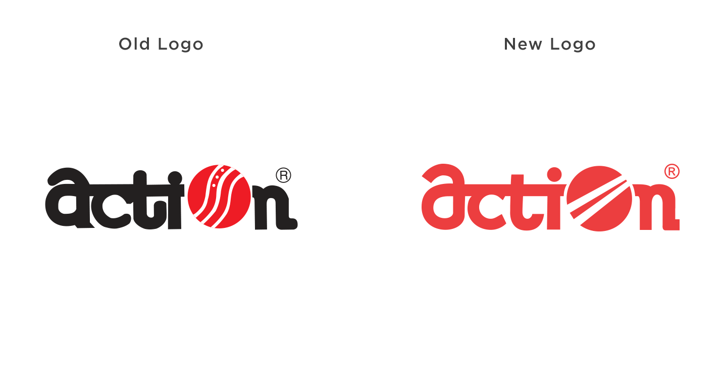
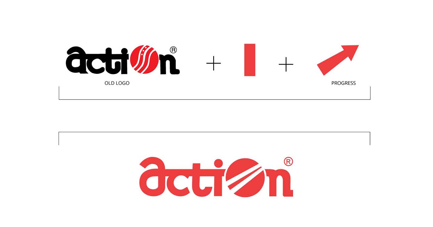
The ball in the previous logo had little significance as Action has other shoes too apart from sports shoes. Keeping in mind that the branding of the company was instilled in the audience’s minds, we had to recreate the logo without removing the previous mental association. We altered the ball in the logo with a forward moving arrow sign. This change subtly signified that progressing ahead is the brand’s positioning.
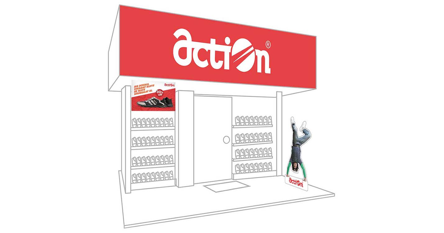
Fresh store designs were generated which entailed the new logo and the new taglines associated with the youthful nature of the brand.
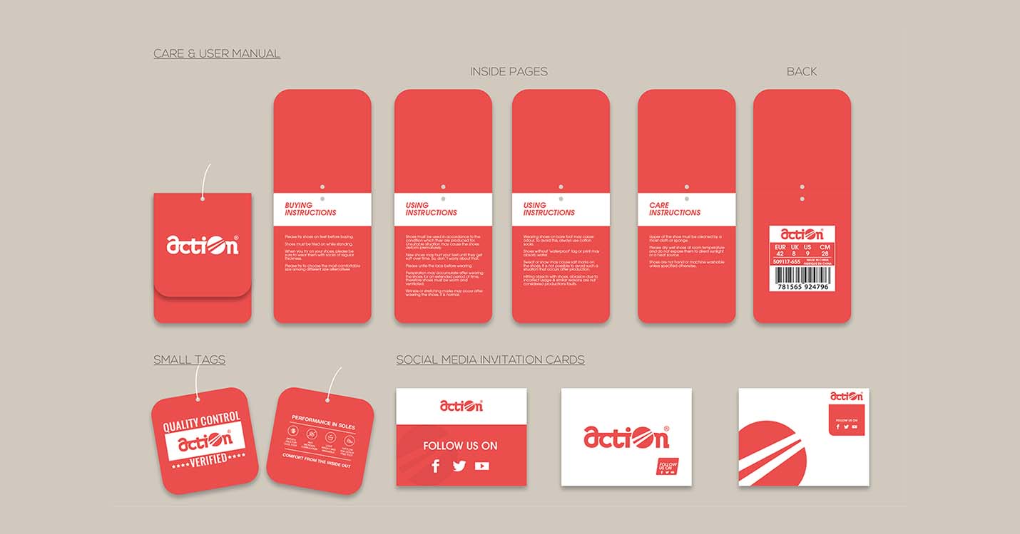
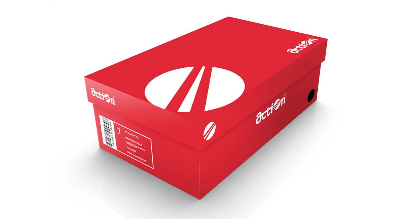
New packaging collaterals and their respective product tags were created all aligned with the brand positioning.
Various collaterals including product posters, standees, in-store danglers and cutouts were furnished for the relaunch event of Action Shoes. Most of the communication channels were used for advertising to create awareness of the new brand identity. The new look has been incorporated across all offline verticals, including the retail stores and the products itself.

