Akarshan Infra is driven by the mission to provide India with the infrastructure it essentially needs to sustain the requirements of the 21st century.
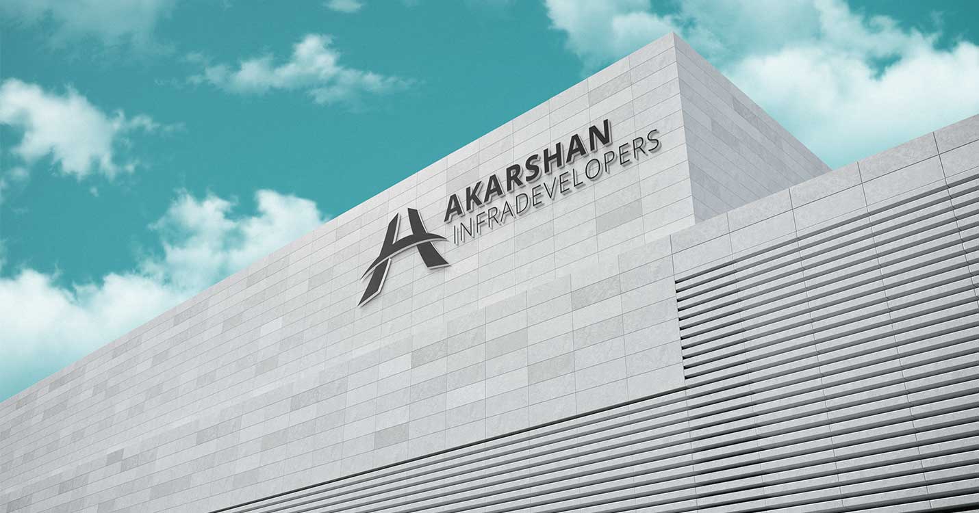
The Creative team focused efforts on carving out a logo that defines a larger-than-life imagery of the real estate industry and retaining the brand name in the process. The final logo retained “A” shape and represented multiple meaningful imageries, such as ‘a bridge and road’.

Corporate Identity including the letterhead, visiting card and marketing brochure was also furnished on the same line of thought.


The Digital team designed and developed Akarshan Infra website adhering to the brand colour palettes and brand elements. The digital presence of Akarshan Infra does retain brand continuity in terms of Design.