GoSwag aimed at increasing their brand reach to a wider range of audience. Apart from that, an ameliorated brand conception was also expected.

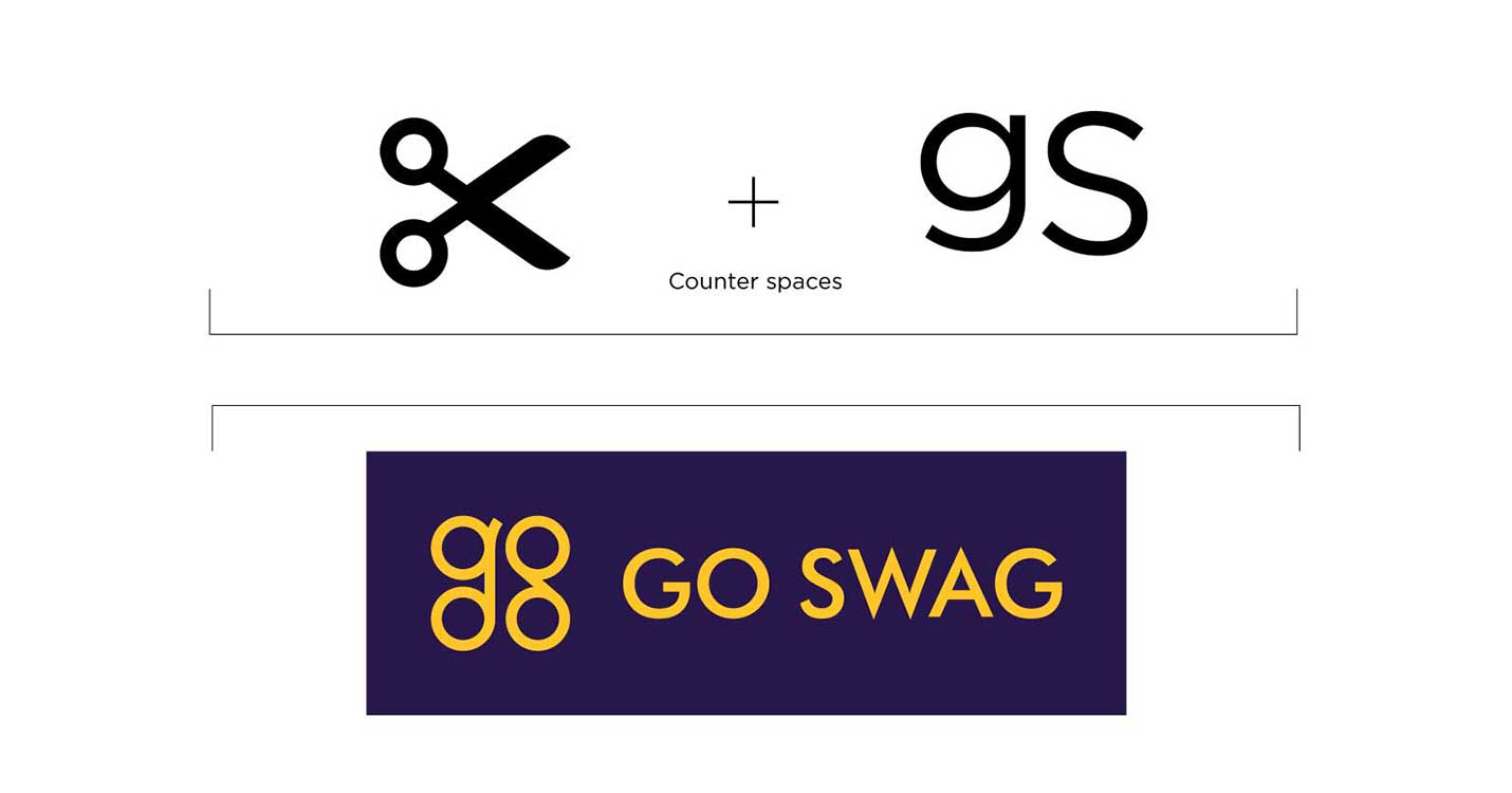
The previous logo conveyed little information about the brand’s services. We revamped the logo with its letters making it more meaningful and relatable with the brand. The letters ‘g’ and ‘s’ were designed in the shape of a scissors’ handgrip.

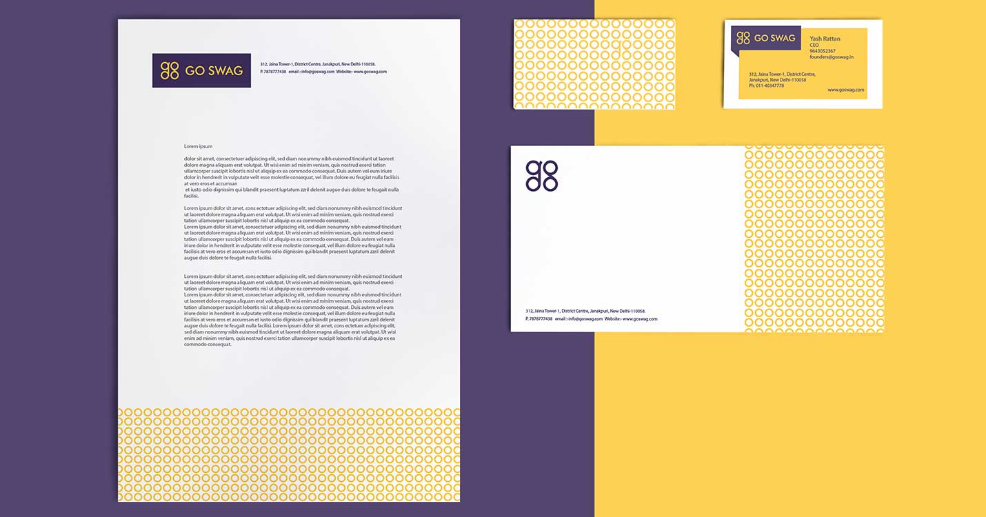
The minimal logo and the brand colour were carried forward across the corporate and marketing collaterals. Since the colour yellow relates to a youthful feeling, it was also employed across these collaterals.

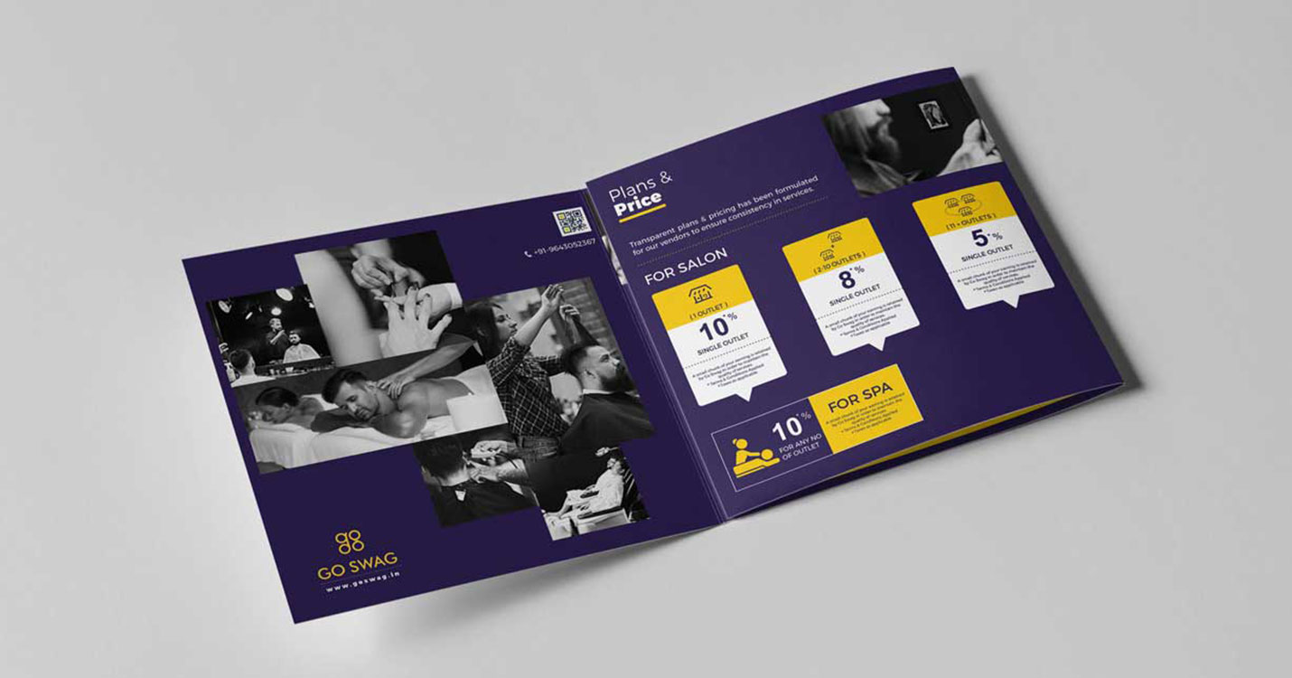
Social Media pages were launched, and regular digital campaigns were being executed to gain more publicity among the people. Brochure and Pamphlets were some of the other manufactured collaterals.
