Zunax, a leader in the power-storage and supplies industry aimed to accentuate their brand presence through their collaboration with Cravants Media.
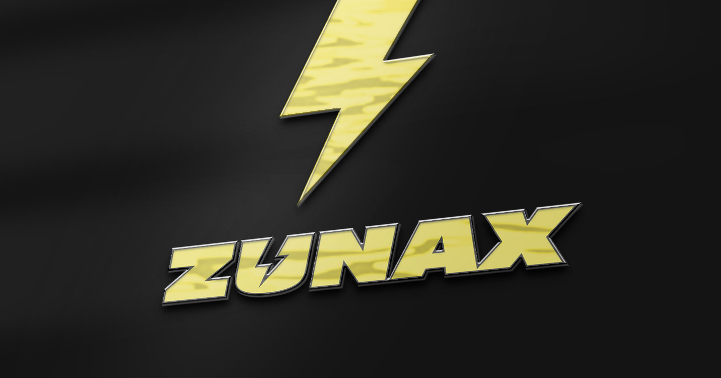
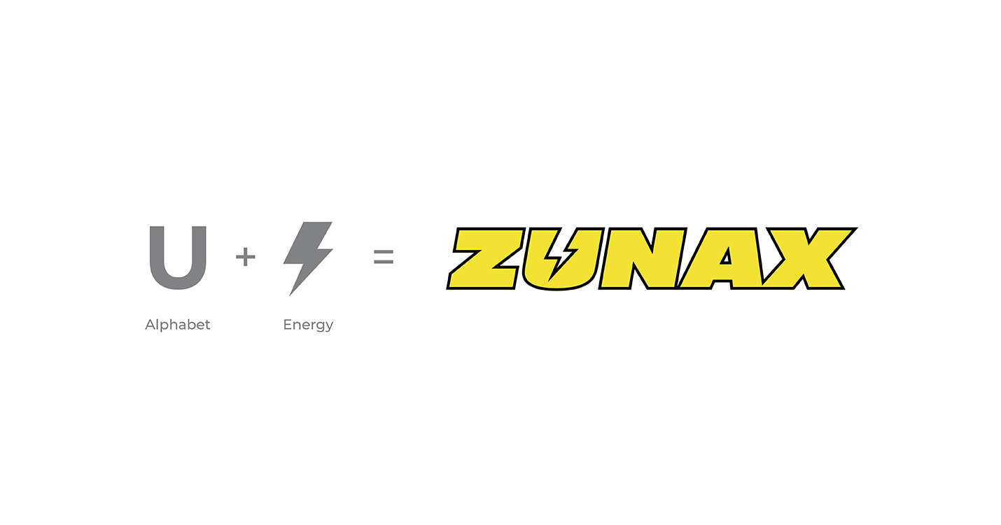
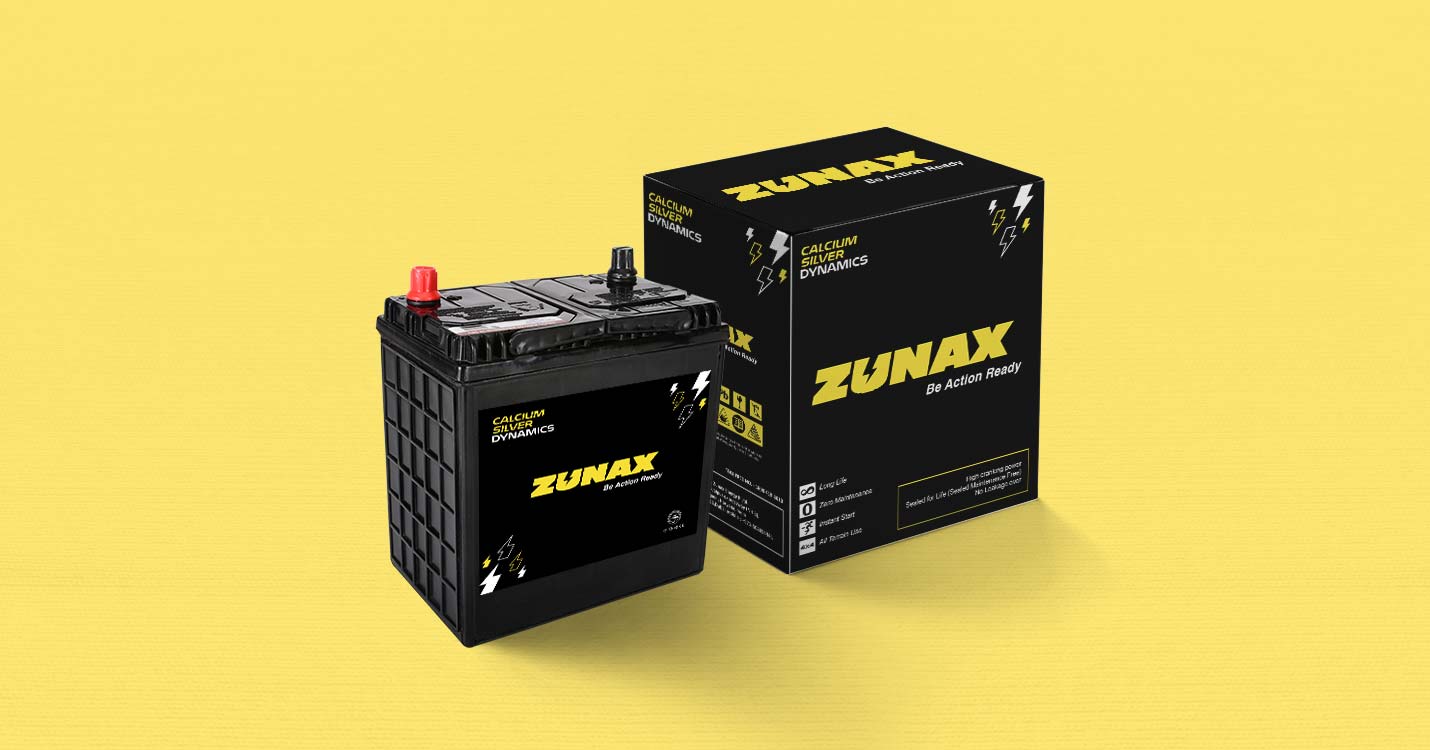
The colour of the logo has been chosen yellow since it portrays the power factor. The negative space of the letter ‘U’ has been used to inculcate the symbol of energy. Moreover, the colour black has been chosen to show the strength and durability of the batteries.
The packaging design and the sticker mainly revolves around the colours and one symbol. The energy symbol has been taken forward from the logo to all these designs as well as a major element.
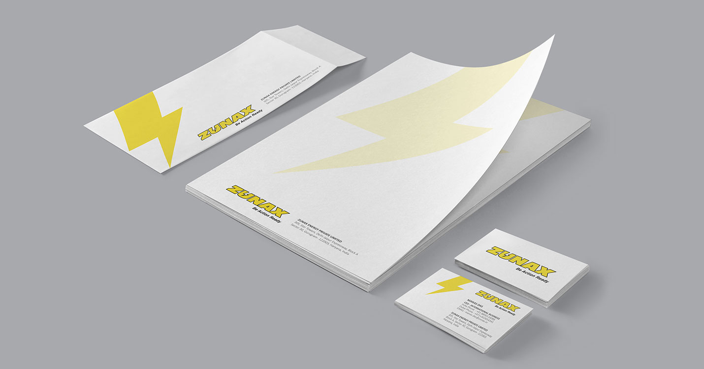
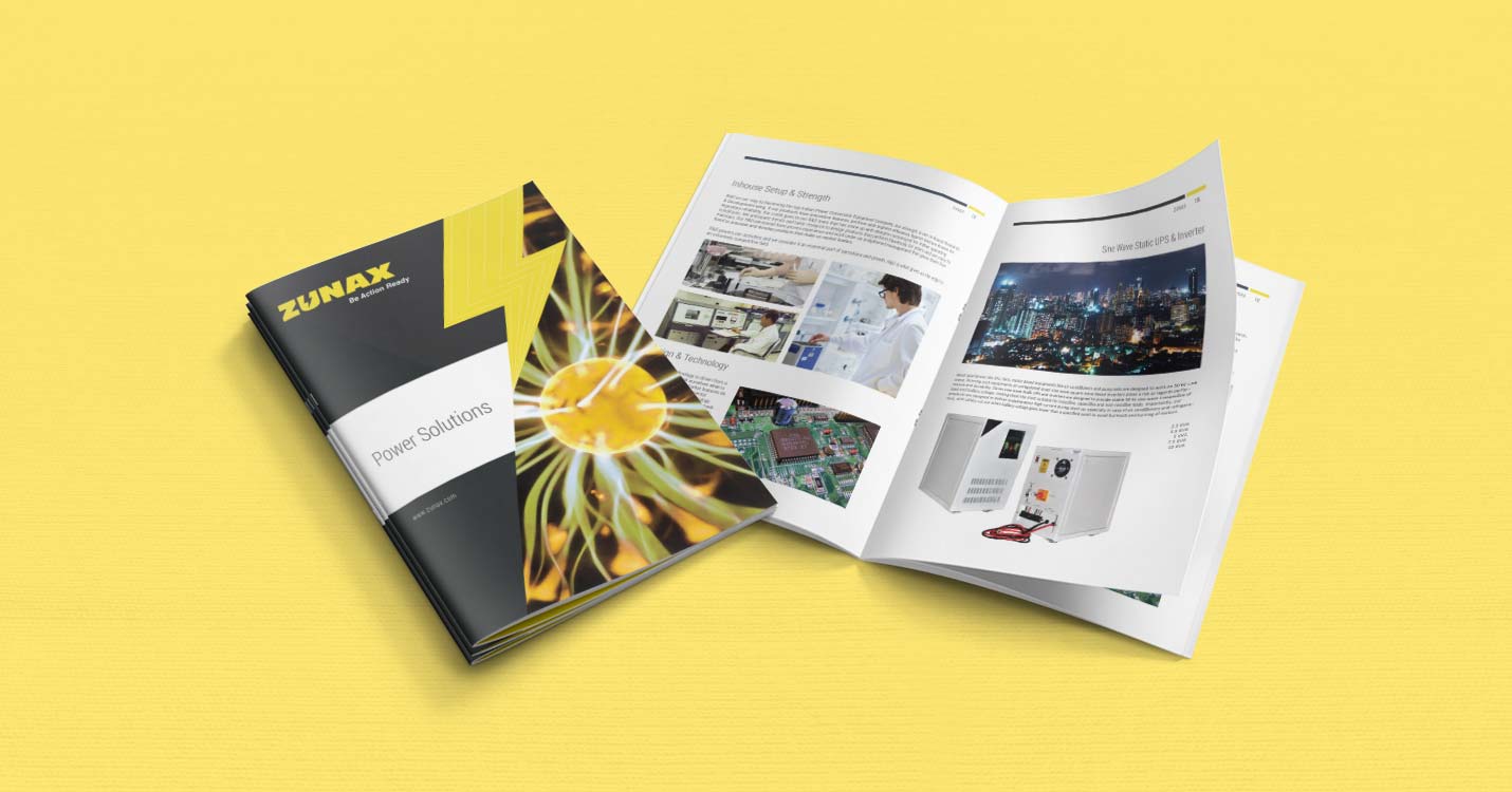
Visiting Card, Letterhead, Envelope and the Product Catalogue was furnished keeping the design continuity in all collaterals.